
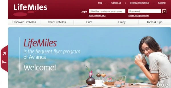
LifeMiles was one of the most important enterprise frontend initiatives I worked on during my time at Avianca. I joined the organization to help deliver the original digital experience, coordinated frontend development for the launch, personally owned the homepage and shared interface architecture, and later contributed to two related initiatives: a reusable toolkit for internal applications and an interactive prototype for in-flight entertainment usability testing.
The work took place across several phases and under very different constraints. The public platform had to be exceptionally fast on the slower internet connections common at the time while still supporting a complex enterprise environment. The internal toolkit needed to help development teams build consistent interfaces without repeating the full design process. The entertainment prototype had to make usability testing feel like a real touch application rather than a sequence of static images.
Scope note — This case study documents the original LifeMiles launch and first redesign delivered during my tenure at Avianca from 2012 to 2017. I was not involved in later redesigns or in the current LifeMiles website.
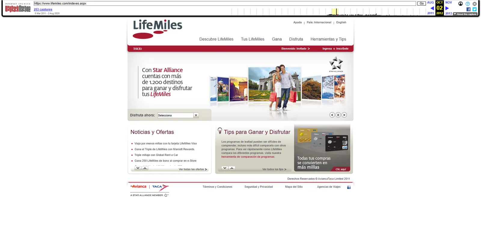
Leading the frontend for the original LifeMiles experience
I served as Project Coordinator and Frontend Development Lead during the initial LifeMiles launch. My role combined coordination with hands-on implementation: I helped guide the frontend team while retaining direct ownership of the most visible and reusable parts of the experience.
I personally developed and maintained the homepage, along with the Master Pages and shared interface elements used throughout the site, including headers, footers, navigation, and sidebars. Centralizing those components gave the broader development team a stable structure for adding pages without recreating the surrounding layout or introducing unnecessary inconsistencies.
I also worked on the platform’s first redesign after the successful launch. The archived screenshots in this case study show the experience from that period, rather than later versions of LifeMiles.
Performance engineering before fast connections were the norm
Performance was not an afterthought on LifeMiles. At a time when many visitors had substantially slower connections than those available today, every request and every asset mattered. I became personally invested in reducing the homepage’s perceived load time as far as the available technology and enterprise platform allowed.
The optimization work included reducing the number of HTTP requests, compressing and carefully preparing visual assets, keeping shared interface code lean, and using CSS image sprites where they produced a meaningful benefit. Sprites allowed multiple interface graphics to be delivered in one file and positioned with CSS, avoiding the overhead of separate requests for every small icon or state.
These decisions were made within a much less forgiving performance environment than today’s. The result was a homepage that felt almost immediate in everyday use, despite the platform’s scale, content, and browser constraints. That experience established a performance-first approach I still apply to modern WordPress and frontend projects: begin with architecture and delivery cost, then use optimization tools to refine an already efficient implementation.
Modernizing under an Internet Explorer 6 requirement
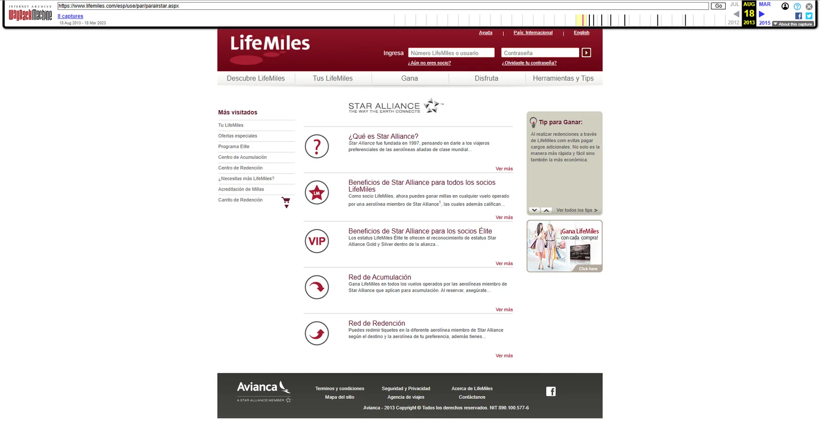
One of the project’s most unusual constraints was mandatory Internet Explorer 6 compatibility. IE6 remained the only browser authorized in parts of the corporate environment, so the frontend could not simply follow the more capable standards supported by contemporary browsers.
That requirement influenced layout decisions, CSS architecture, progressive enhancement, testing, and the amount of compatibility code the platform had to carry. My responsibility was to deliver a reliable experience within that reality while continuing to advocate for a move toward more modern browsers and standards.
The transition took time, but the organization eventually permitted a more modern browser focus. Some legacy compatibility code necessarily remained in the established platform, yet the shift created room for better frontend practices and a more sustainable direction. It was a useful lesson in enterprise modernization: technical improvement often requires both implementation skill and the patience to build organizational support for change.
Reusable architecture and multilingual continuity
The site’s shared frontend was organized around reusable ASP.NET Master Pages and components. Maintaining global elements centrally helped a multi-developer team deliver a consistent experience and made later updates to navigation and layout significantly more manageable.
The platform also required multilingual navigation. I developed lightweight preference logic that remembered a visitor’s selected language, allowing the experience to preserve that choice as users moved through the site or followed links shared by colleagues in other countries. The same practical language-preference approach later proved useful across related Avianca digital properties.
This work was less about adding a language selector and more about making localization behave predictably for an international user base. The goal was continuity: once users expressed a language preference, the interface should respect it instead of repeatedly making them correct the site.
An XML-driven optimizer built for speed and operational flexibility
I also developed an interactive LifeMiles Optimizer that translated a member’s earning and redemption activity into a visual aviation-themed rank. The experience used two gauges for Earn and Enjoy activity and a set of aircraft states—including On Board, Grounded, Taxiing, Taking Off, Ascending, Descending, and two cruising levels—to explain how effectively a member was using the loyalty program.
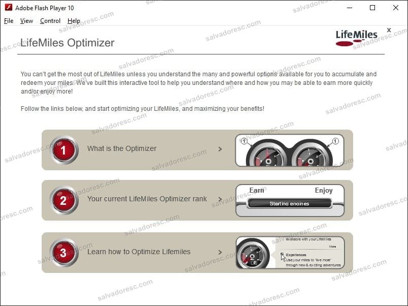
The application was deliberately modular. A lightweight main SWF acted as the shell and loaded the explanation, interactive simulator, or personalized member view only when requested. This reduced the initial payload and prevented visitors from downloading sections they never opened—an early form of the on-demand loading and code-splitting strategies commonly used in modern frontend applications.
Content was separated from the compiled interface. Checkbox labels, descriptions, recommendations, and other editable information were loaded from external XML files. Business teams could therefore update content without opening the original FLA, changing ActionScript, recompiling the application, or depending on me for routine editorial changes. This was particularly valuable inside an enterprise environment where deploying application code required a formal change-control process, while authorized content files could be updated much more quickly.
The interactive simulator let visitors select the ways they earned and redeemed miles. ActionScript counted both dimensions, updated the gauges, applied a lookup matrix representing the approved business rules, and moved the aircraft interface to the corresponding visual status.
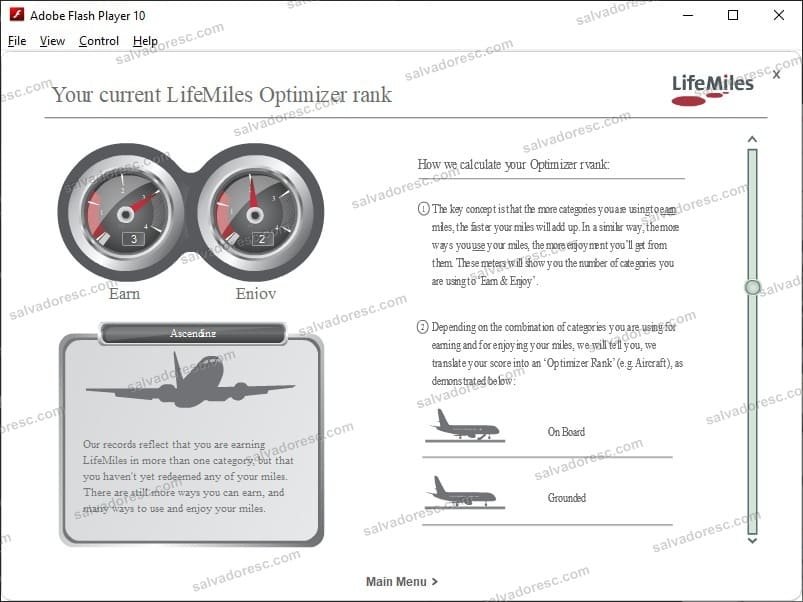
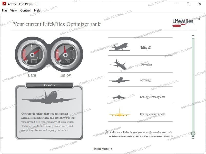
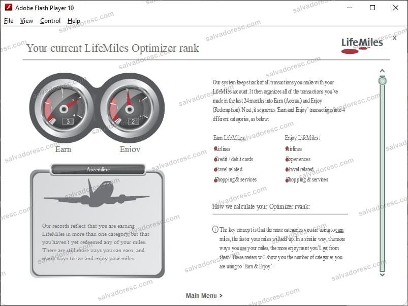
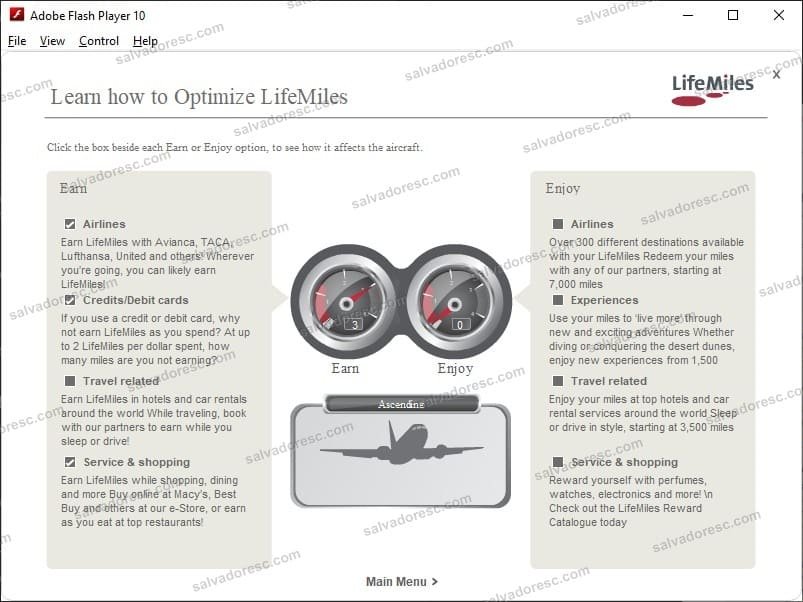
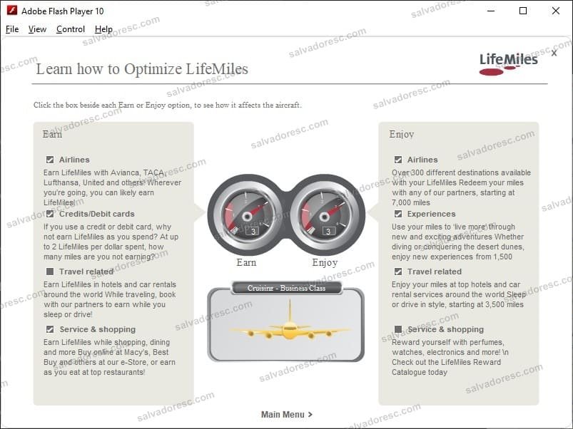
Working with a trusted colleague, I implemented the Optimizer’s business rules as a two-dimensional lookup matrix instead of a growing tree of conditional statements. Each combination of Earn and Enjoy activity mapped directly to one of eight customer statuses. The approach made all 25 possible combinations easy to verify, produced an immediate response in the interactive experience, and was later adopted by the backend development team in its .NET implementation after its original conditional approach became difficult to maintain.
The personalized view extended the same model with real account data. I coordinated the data contract with the backend development team: after authentication, an ASPX endpoint generated user-specific XML describing the categories in which that member had earned and used miles. The SWF consumed that response, calculated the member’s rank, positioned the gauges, and rendered the appropriate aircraft state and recommendations. The recovered demonstration files use static XML fixtures, but preserve the same frontend integration architecture used for the service response.
The broader LifeMiles platform maintained Spanish and English experiences through parallel /esp/ and /eng/ routes. The recovered Optimizer artifact is the English package; its external XML separation made parallel localized content sets considerably easier to maintain without changing the core interaction model.
Flash and ActionScript are now legacy technologies, but the engineering decisions remain directly relevant: modular delivery, loading features on demand, separating code from content, consuming personalized service data, encoding business rules in a deterministic decision model, and designing around real operational constraints.
An internal frontend toolkit before “design systems” became standard
After the public launch, I was asked to create a frontend toolkit for Avianca’s internal development teams. In current terminology, the project would sit somewhere between a component library, a design system, and an implementation guide.
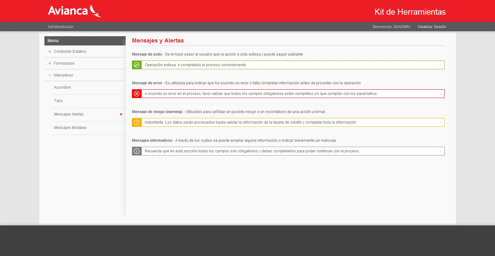
Internal programmers regularly needed to create administrative tools and web applications. Without a shared foundation, each project could require new design decisions and produce a different interface. The toolkit provided reusable templates, layouts, form patterns, navigation, alerts, modal behavior, interactive components, and other common UI building blocks.
I combined Bootstrap, AngularJS, and Material Design principles to produce examples that developers could inspect and reuse. The toolkit documented not only how components looked, but how they behaved in practical application states such as validation, successful actions, warnings, errors, pre-populated fields, and multi-column forms.
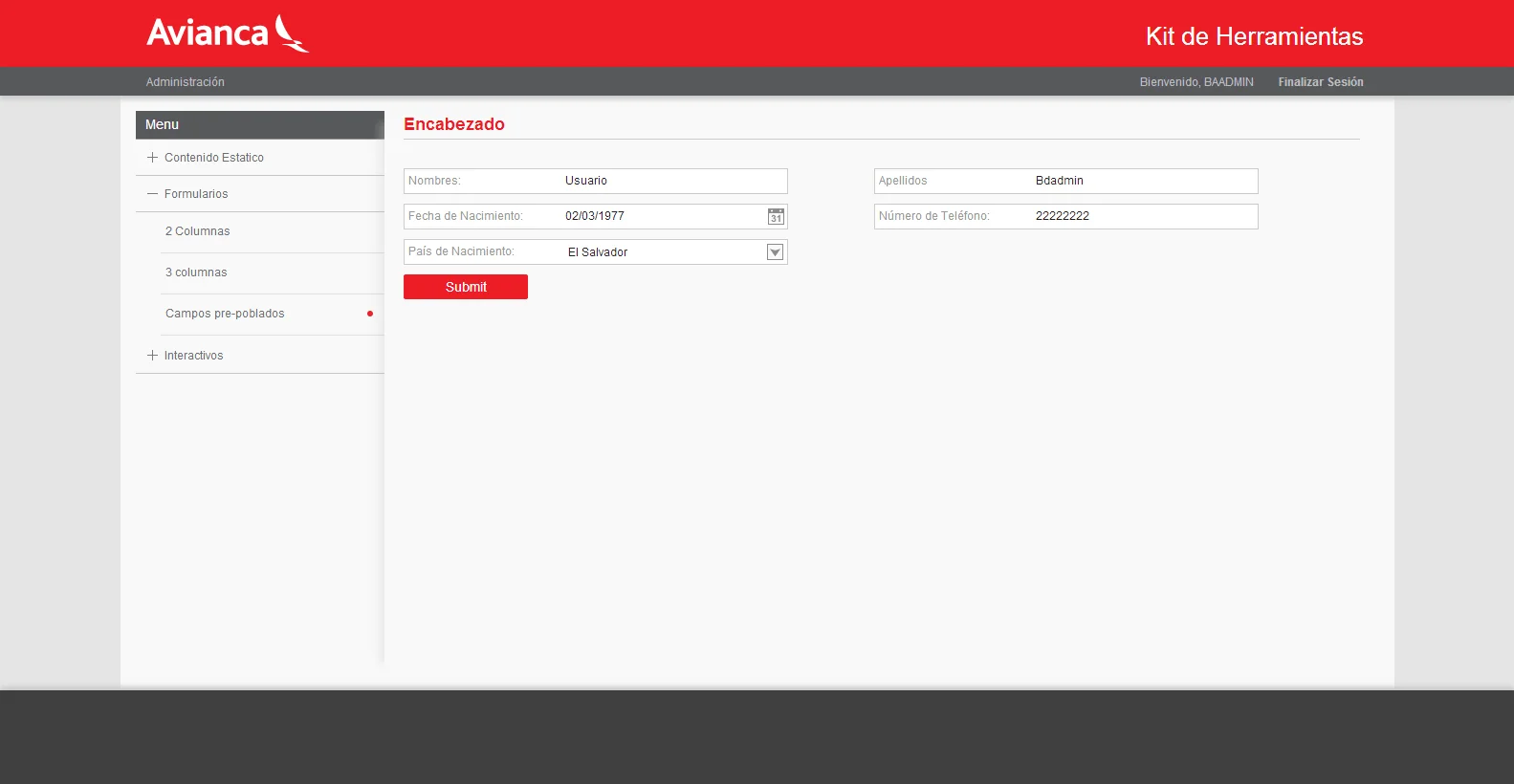
This standardized the user experience across internal products, reduced duplicated frontend effort, and allowed developers to assemble familiar interfaces without sending every routine application through a complete design cycle. The screenshots preserved in this case study show the toolkit itself functioning as interactive documentation.
Turning static usability tests into an interactive touch prototype
Another phase of the work involved the proposed in-flight entertainment experience for Avianca aircraft. It is important to distinguish my contribution from the production avionics system: I did not develop the final software installed on the aircraft. That implementation was the responsibility of an authorized specialist vendor. My work supported the design and usability validation that happened before the production handoff.
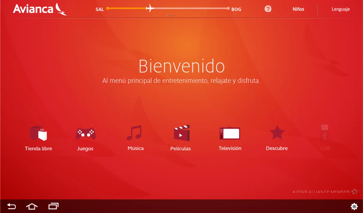
The design team needed to test navigation, content discovery, and interaction patterns with real participants. Early tests using static screens and click maps provided useful feedback, but they could not reproduce the feeling of navigating an application on a touch device. Tapping through a real interface is fundamentally different from indicating where one would click on an image.
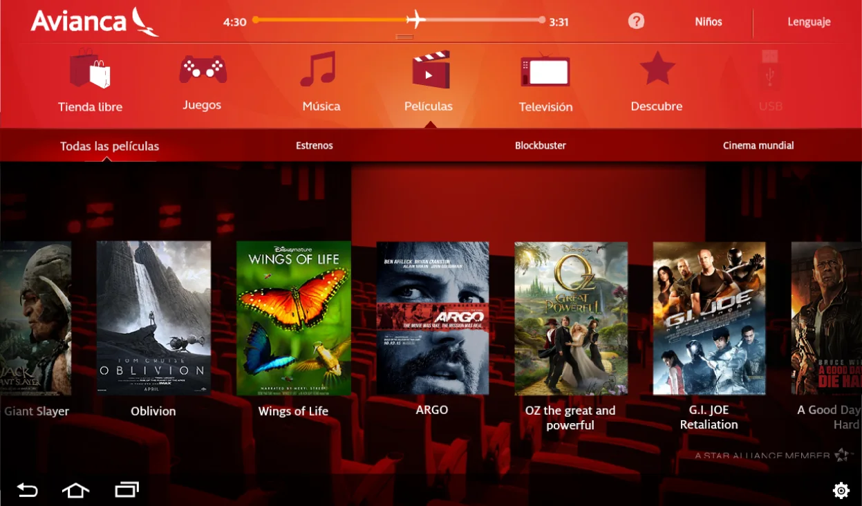
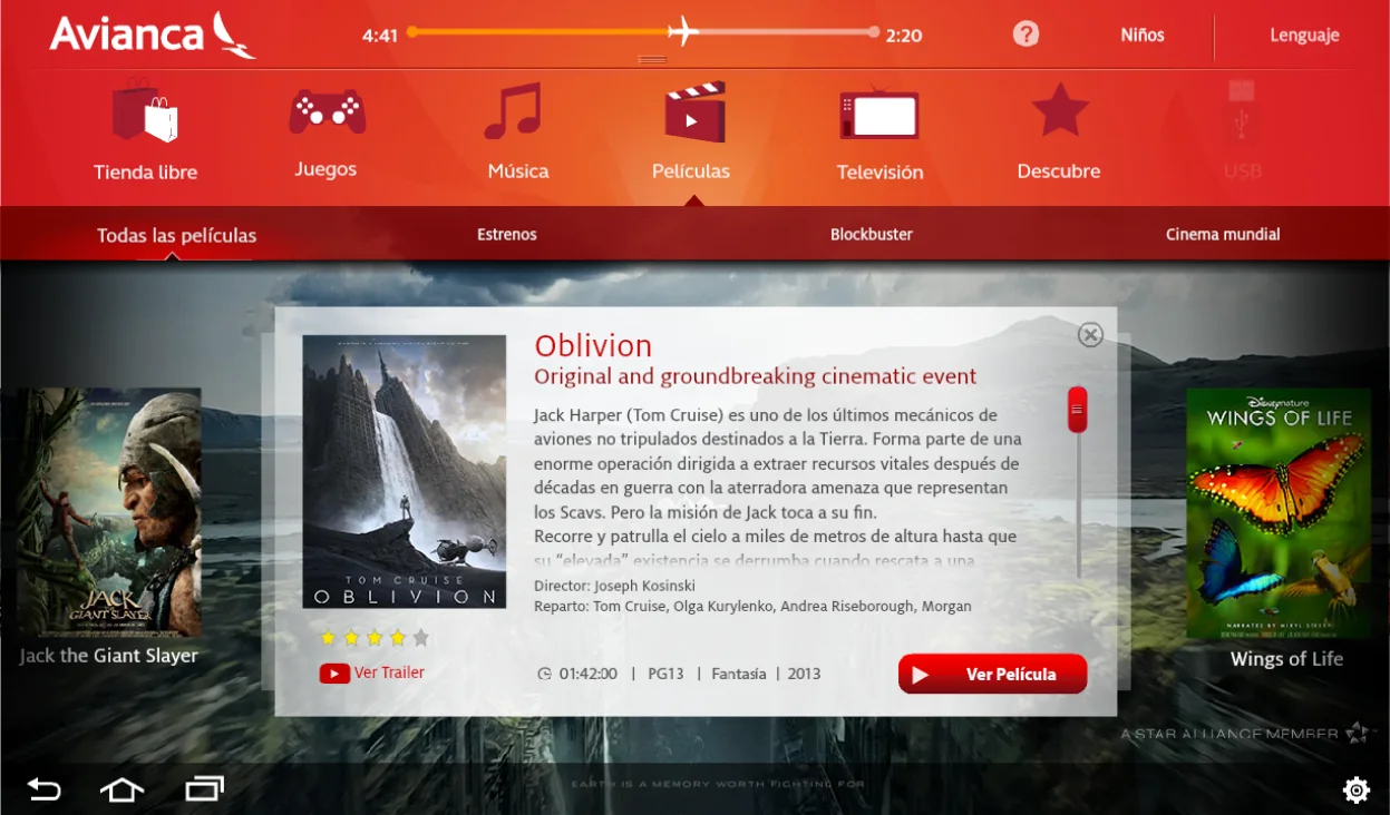
I proposed building an interactive prototype that simulated the entertainment system closely enough for higher-fidelity testing. I implemented the experience in Adobe Flash and ActionScript, then packaged it with Adobe AIR as an Android application for installation on a Samsung Galaxy Tab. The tablet provided an accessible approximation of the touch hardware passengers would eventually use.
The prototype included language selection, adult and children’s experiences, global navigation, flight-progress context, movies, television, music, games, shopping, content details, playback controls, playlists, and multiple interactive states. Participants could move through the interface, open content, operate controls, and encounter navigation decisions in context rather than reviewing isolated compositions.
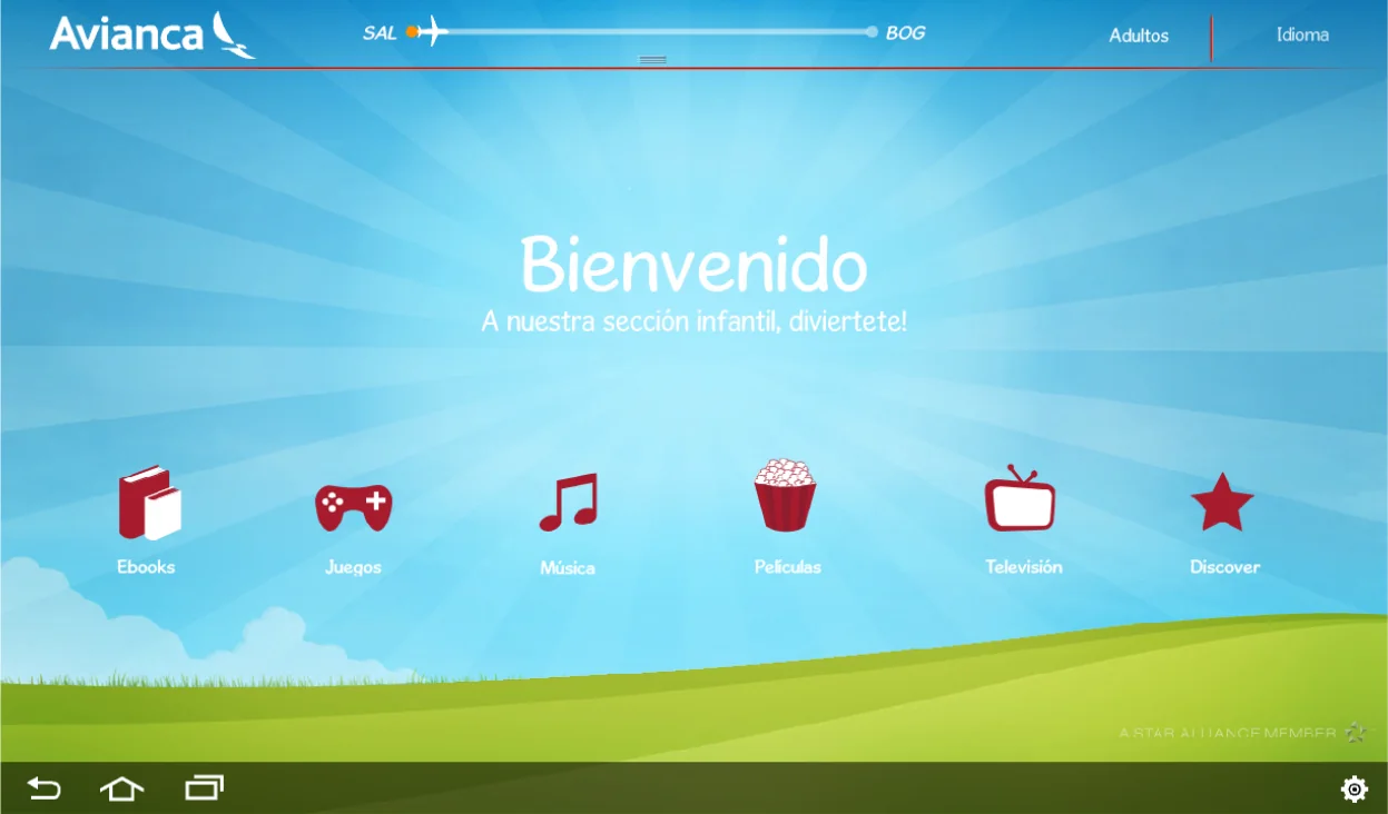
This gave the design team a far more realistic environment for observing behavior and refining the experience before specifications were handed to the external implementation vendor. It also demonstrated the value of prototypes as engineering tools: the objective was not production code, but reducing uncertainty before production development began.
What this project demonstrates
LifeMiles brought together several forms of frontend leadership. I coordinated delivery while remaining responsible for critical production code, pursued aggressive performance improvements under severe browser limitations, created reusable architecture for both public and internal systems, and used application development to improve the quality of UX research.
The technologies reflect their era, but the engineering principles remain current: keep shared systems reusable, make performance an architectural concern, design around real organizational constraints, test interactions in a realistic medium, and document scope honestly when a long-lived product changes after your involvement ends.
Key contributions
- Coordinated frontend delivery for the original LifeMiles launch.
- Personally developed and maintained the homepage and shared Master Page architecture.
- Built reusable headers, footers, navigation, sidebars, and layout structures for a multi-developer enterprise platform.
- Reduced request overhead and optimized assets, including the strategic use of CSS sprites.
- Delivered a fast perceived experience for the slower connections common at the time.
- Supported mandatory IE6 compatibility while advocating for a transition to modern browser standards.
- Contributed to the first redesign delivered after the platform’s successful launch.
- Implemented persistent multilingual preference behavior for international users.
- Created an internal frontend toolkit using Bootstrap, AngularJS, and Material Design principles.
- Built an interactive ActionScript prototype and packaged it with Adobe AIR for touch usability testing on an Android tablet.
- Simulated navigation, media discovery, playback, language selection, and child-focused flows before handoff to the authorized production vendor.
Technologies
HTML, CSS, JavaScript, jQuery, ASP.NET Web Forms, Master Pages, CSS image sprites, AngularJS, Bootstrap, Material Design, Adobe Flash, ActionScript, Adobe AIR, and Android prototyping.